Let’s Start with Better Floodplain Maps
Share
After a historic hurricane season, managing and preventing flood damage to homes and infrastructure has become a national priority. As FEMA Administrator Brock Long pointed out in his recent Senate testimony, the United States’ natural disaster response apparatus is in immediate need of reforms. The proposal that Administrator Long outlined included: reforms to simplify and streamline the various disaster recovery programs across the federal government, fixes to the insolvent National Flood Insurance Program (NFIP), expanded workforce development and hiring practices for FEMA (akin to the FBI academy program), and increased support for both state “baseline capabilities” and pre-disaster mitigation.
Each of those reforms deserve serious consideration from Congress, but missing from the list is a solution to one fundamental flaw that kneecaps both mitigation and recovery efforts ? FEMA’s antiquated floodplain maps.
To determine who is most at risk of flooding, FEMA maintains a database of maps that chart the areas susceptible to both 100-year (1 percent chance per year) and 500-year floods. Notably, these 100-year and 500-year categories are not rooted in science, but are the product of a 1973 compromise between the Army Corps of Engineers’ strict standards and the more lax but established local policies. The categories are also based on a hodgepodge of data that was collected anywhere between 1900 and 1960.
From infrastructure to housing, the floodplain maps serve as the foundation for natural disaster planning, management, insurance, and mitigation policies. Today, 5 percent of housing in the U.S. is located within a 100-year floodplain, and the monthly premiums for NFIP’s 4.9 million policies are almost entirely based on the floodplain maps.
Uncharted Waters
The floodplain maps are full of problems. First, the maps vary drastically in age, with some communities still relying on 40-year-old, hand drawn maps. Of the 22,000 communities that FEMA manages flood mapping for, 15 percent have maps that are over 15 years old. As of December 2016, 68 percent of the maps required a restudy or further assessment. Not to mention, as global temperatures continue to rise, the average 100-year floodplain’s size is projected to increase 45 percent by 2100.
Updating these maps is another challenge entirely. Of the maps that are being updated, 12 percent have been placed on hold, with the majority waiting an average of nearly 3 years before making progress. Further complicating the process, FEMA often faces local resistance due to the possibility that a new map may result in increased insurance rates. But with the federal government using an incomplete picture of the nation’s flood risks, the current pool of NFIP’s rates and enrolled populations are unable to cover the cost of a major disaster.
Age of FEMA’s Floodplain Maps
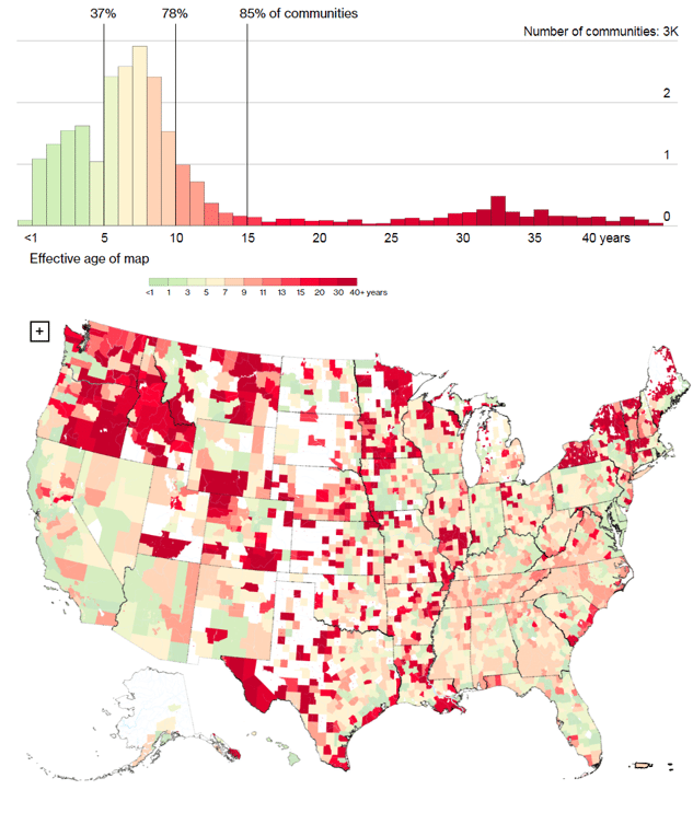
Areas without data do not participate in the NFIP or do not have reliable data. Source: FEMA and Bloomberg.
Unfortunately, age is not the only problem and making all new maps will only go so far. A recent report from the Department of Homeland Security found that, due to lapses in management and oversight of the flood mapping process, FEMA is “unable to assess flood hazard miles to meet its program goal and is not ensuring mapping partner quality…” Concluding that, in FEMA’s current state, it cannot provide the public with an accurate portrayal of their flood risks. In addition to the process and oversight problems, one of the fundamental issues is that the maps are one dimensional, in that they:
- Do not incorporate predictive modeling that accounts for worsening floods from climate change or the potential impacts of population growth;
- Only account for binary, upstream or downstream flooding, ignoring direct flooding from rapid rainfall accumulation; and
- Only use a single classification for entire neighborhoods, disregarding fluctuations in elevation, variance in surfaces, and land usage.
As is currently being demonstrated in Houston, these flood maps directly impact local policies. During Hurricane Harvey’s record setting 33 trillion gallons of rain, the floodplain maps missed 75 percent of the affected area. But in a recent ProPublica piece, residents reported being excluded from a local buyout program because they were not located in FEMA’s 100-year floodplain, despite their homes repeatedly flooding. On average, over 25 percent of NFIP claims come from outside of the identified floodplain.
Floodplain Map from before and after Hurricane Sandy
Share
Read Next
Support Research Like This
With your support, BPC can continue to fund important research like this by combining the best ideas from both parties to promote health, security, and opportunity for all Americans.
Give NowRelated Articles
Join Our Mailing List
BPC drives principled and politically viable policy solutions through the power of rigorous analysis, painstaking negotiation, and aggressive advocacy.